The secret to doing any job well is having the right tool for the job. If you need to masculine cards, scrapbook pages or gift packaging, the Trusty Tools bundle is the right tool to have in your toolbox.
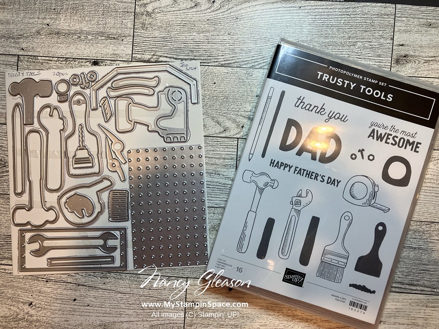
The 16 piece Trusty Tool stamp set #163274 has all the tools and sentiments you need, and the coordinating 20 piece Trusty Tool dies #162722 has all the tools you’ll need for the handyman, or handywoman, in your life! BONUS – when you order the Trusty Tools Bundle #162723 you’ll Save 10% and qualify to get the Trusty Toolbox DSP FREE during Sale-A-Bration!
Let’s take a look at the products, then I’ll show you the project I made.
Trusty Tools Bundle
The stamp set and dies can be purchased separately or you can save 10% when you purchase the bundle!
Trusty Tools stamp set # 163274 – $24.00, Trusty Tools Dies #162722 $37.00, and the Trusty Tools Bundle # 162723 (Bundle & Save 10%) $ 54.74
When you purchase the Bundle during Sale-A-Bration, you can earn the Trusty Toolbox DSP for FREE! Look at all that coordination! Makes my heart happy!
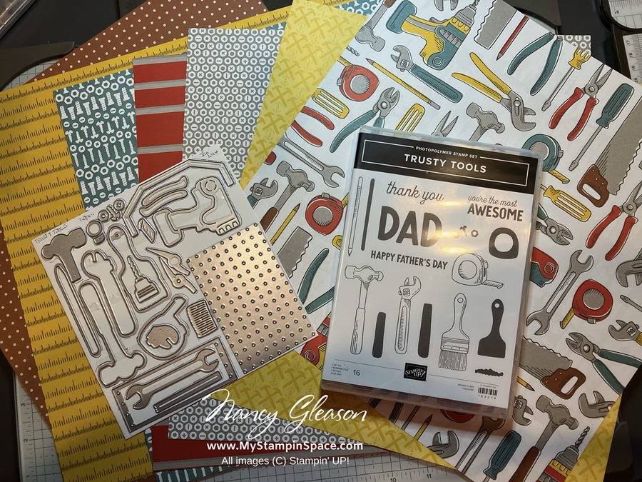
Did you know that many of the tools on this DSP can be cropped out with the dies?
Now I want to show you the card I made with this bundle.
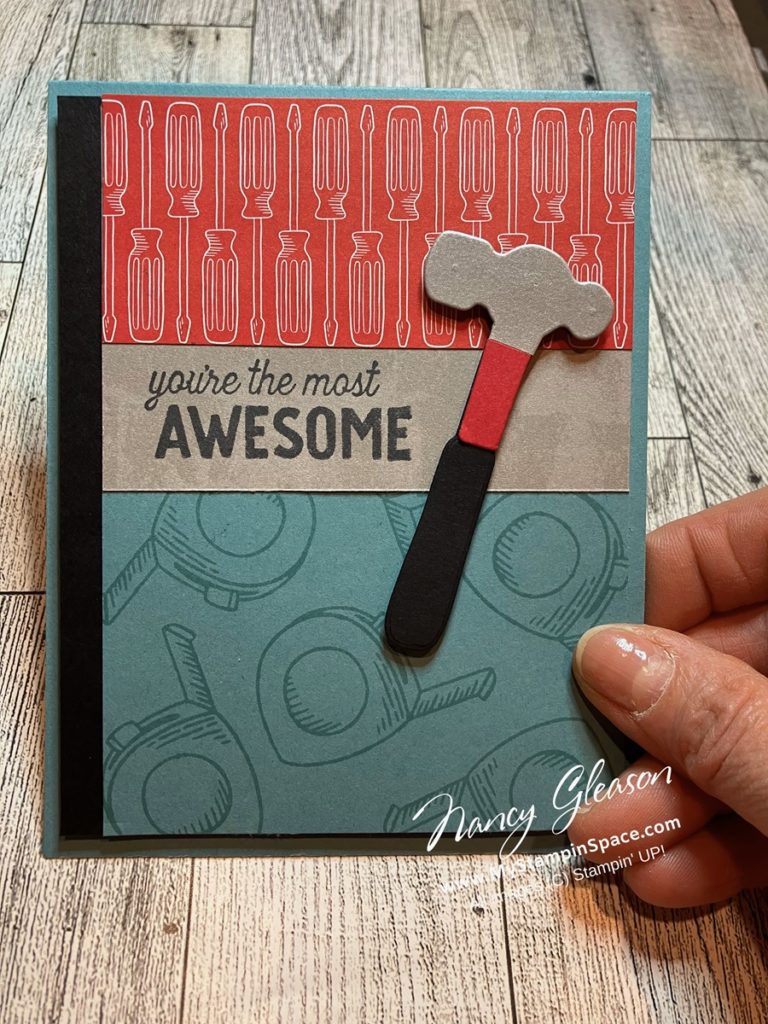
My husband recently added some shelves in a closet for me. He used his drill, screwdriver and of course his tape measure. He also used his hammer to drive in a few nails to hang things on. This card was made to thank him, and I used the tape measure stamp, the screwdriver pattern of the DSP, and the dies to create the hammer. His hammer has a black handle, a red neck and a metal head. I was able to re-create his hammer out of paper. How cool, right?
I will probably get a lot of use out of this bundle. I’ll be sure to share any other cards I make with you. Follow me on Facebook and Pinterest to make sure you don’t miss anything.
Please be sure to share any pictures of projects you make using this bundle! I love to see what you make.
If you want to order this bundle, or anything else, just click here to access my online store. Thanks for your support!
Nancy